I design CCaaS and CRM platforms with a focus on wireframing and product design, and I also create the product videos, social posts, and motion graphics that bring them to life.
Designed an AI-powered CCaaS platform that reimagines traditional contact center workflows with a conversational, assistant-first experience. Instead of navigating multiple settings and complex configurations, users are guided by AI at every step — from setup and automation to testing and optimization — making enterprise operations faster and more intuitive to manage.
End-to-end solo design of a centralized admin workspace that pulled account, user, and billing management out of separate tab-heavy screens into one connected experience — with conversational AI as the primary way admins complete everyday tasks.
Concept, script, and storyboard for a 30-second product video introducing an AI-powered Customer Data Platform with Customer Value Management capabilities — built to help CMOs in retail and hospitality catch customer churn before it happens.
I'm a UI/UX designer with a year of hands-on experience designing SaaS products — mainly CCaaS and CRM platforms — where I focus on wireframing, product design, and turning complex enterprise workflows into experiences that feel guided rather than overwhelming.
Alongside product design, I create product videos, social media posters, and GIF animations, which lets me carry a product's story beyond the interface itself, from how it works to how it's communicated to the world.
Good design should guide, not overwhelm — whether it's a complex SaaS workflow or a ten-second video.
Rebuilding a contact-center platform around one idea: the AI should actively assist the agent through every step of a conversation, not sit beside it as an add-on feature.
Most CCaaS platforms today are still built around a traditional, manual workflow. Agents are expected to juggle customer information, CRM records, past interaction history, and next steps entirely on their own — with no real assistance during the conversation itself.
This creates heavy cognitive load. Agents constantly switch between screens and tools just to piece together context, which slows down resolutions and makes the job harder than it needs to be, especially for newer agents.
We set out to challenge that default. Instead of adding more panels and more manual steps, we asked: what if the AI actively assisted the agent throughout the entire conversation — not just as an add-on feature, but as the backbone of how the product works?
My role: I led this research and competitive analysis.
I studied how leading CCaaS and support platforms — Genesys Cloud CX, Zendesk, Five9, and Talkdesk — handle the agent experience. The pattern across all of them was consistent: the problem was never a lack of features. It was complexity.
Packs in powerful AI features like Copilot, but the density of panels and menus can overwhelm agents, especially when relevant CRM data isn't fully embedded in the main view.
Takes a ticket-first approach that's easy to learn, but puts the burden of classification and context-building entirely on the agent — priority, business impact, type, and product area are all filled in by hand, with no AI guidance surfaced during the conversation itself.
Offers strong CRM integration but leans on a more traditional layout, often splitting customer info across multiple windows.
Comes closest to a guided, modern experience with dedicated Agent Assist and Notes tabs, but deeper AI and automation capabilities are often locked behind higher-tier plans, and contact details still live in separate views.
None of these platforms fully removed the burden of managing multiple information sources during a live interaction. There was a clear opportunity to build a workspace that didn't just add AI as a feature, but used it to actively reduce the agent's workload — surfacing the right context automatically, guiding next steps, and cutting down on manual navigation.
That insight became the foundation for how we approached the whole product.
I worked across the full product rather than a single module — owning UX research and competitor analysis, and contributing to the layout and interaction design across every major module of the CCaaS platform, working closely with the team throughout the 3-month build.
We rebuilt the product around one core principle: make the AI a working partner throughout the agent's process, not a bolt-on feature. Here's how that played out across the key modules.
Instead of a static landing page, the home screen surfaces live data — what's happening across the contact center right now, updating in real time. Agents get immediate context the moment they log in, instead of having to dig for it.
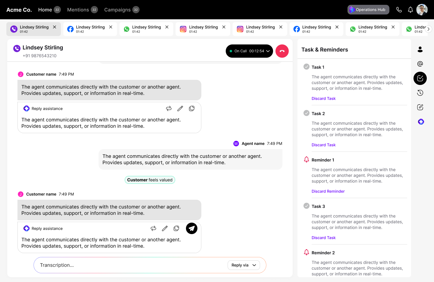
This was the core of the redesign. Traditional workspaces spread customer context across scattered panels. We consolidated it: customer information sits in a dedicated space alongside the conversation, with tasks, reminders, and interaction history built in — all restructured around a conversational interaction model rather than static forms and fields.
The standout feature: an AI Assist panel that supports the agent live, during the conversation — helping shape the next response to the customer based on context, rather than leaving the agent to figure it out alone.
We extended the same conversational approach to campaign management. Instead of multi-step manual setup, agents can create a campaign, assign it to an agent or queue, and schedule it — all through a conversational, automated flow.
The result was a fully automated, conversation-first workflow — a meaningful departure from how traditional CCaaS products operate. Where most competitors offer AI as an isolated feature in one part of the product, we built AI assistance into every major touchpoint of the agent's process.
Early feedback from users was positive, particularly around how much manual work the conversational automation removed from day-to-day tasks.
Working across the entire product rather than a single module pushed me to think beyond individual screens and consider how modules connect as one system — the home dashboard, agent workspace, and campaign flow all needed to feel like one consistent conversational experience, not three separate features stitched together.
The hardest part of the project was resisting the instinct to just add more panels and information the way most competitor products do. The research made it clear that the real opportunity wasn't more features — it was reducing what the agent had to manage manually. Committing to a conversational, AI-first approach meant rethinking familiar patterns, like tasks, reminders, and interaction history, instead of just copying how existing tools handle them.
If I were to take this further, I'd want to validate the AI Assist responses more rigorously with real agents over a longer period, to see how it holds up across edge cases and high-pressure conversations — not just typical ones.
Pulling account, user, and billing management out of scattered tabs into one connected workspace — and making conversational AI the primary way admins get things done, not a bolt-on shortcut.
Across the company's product line, account and plan administration followed the pattern most enterprise SaaS tools still rely on: admins clicking through tab after tab to get anything done. Managing users, assigning permissions, buying add-ons, or updating a subscription each meant a separate detour through its own screen and its own set of forms — and because every product in the lineup handled this differently, the experience wasn't even consistent from one tool to the next.
The goal was to collapse all of it into a single, centralized workspace — one place to manage account settings, users, permissions, teams, and subscriptions across every product — and to put conversational AI at the center of it, so admins could get common tasks done by describing what they needed instead of hunting through menus.
My role: solo research and analysis.
I looked at how leading enterprise platforms structure their admin experiences — specifically how each handled user management, billing, and permissions.
Organization management, licensing, and user administration, built for scale but spread across a wide surface area of distinct sections.
Handles user management, groups, and billing, with each area living as its own separate flow rather than a connected whole.
Covers roles, teams, and products, but configuring any one of them means moving through several distinct screens in sequence.
Deep, flexible enterprise configuration and permissions — powerful, but that flexibility comes at the cost of a steep, form-heavy setup process.
A few patterns showed up consistently across all four: administration was fragmented across separate sections for users, billing, and permissions, adding navigation overhead for admins trying to see the full picture. Workflows leaned heavily on forms — creating a user or updating a subscription meant working through multiple configuration screens. Permission systems were flexible but complex, often taking several steps to configure for a large org. And automation was minimal almost everywhere; even routine, repetitive tasks relied on traditional click-through interfaces rather than any real assistance.
None of the platforms I studied combined centralized administration with conversational AI. That gap became the core direction for MyPlans — let administrators complete complex, multi-step tasks through natural language instead of navigating screen after screen.
I designed the end-to-end administration experience for MyPlans, solo, from scratch — defining the overall information architecture for the admin center, structuring account management, user management, and billing into one unified experience, designing the workflows for roles, users, teams, and subscription management, and building the conversational AI flows for common administrative tasks. I also built the reusable UI patterns and components that kept the experience consistent across modules, and worked closely with product managers and engineers to validate workflows against real implementation constraints.
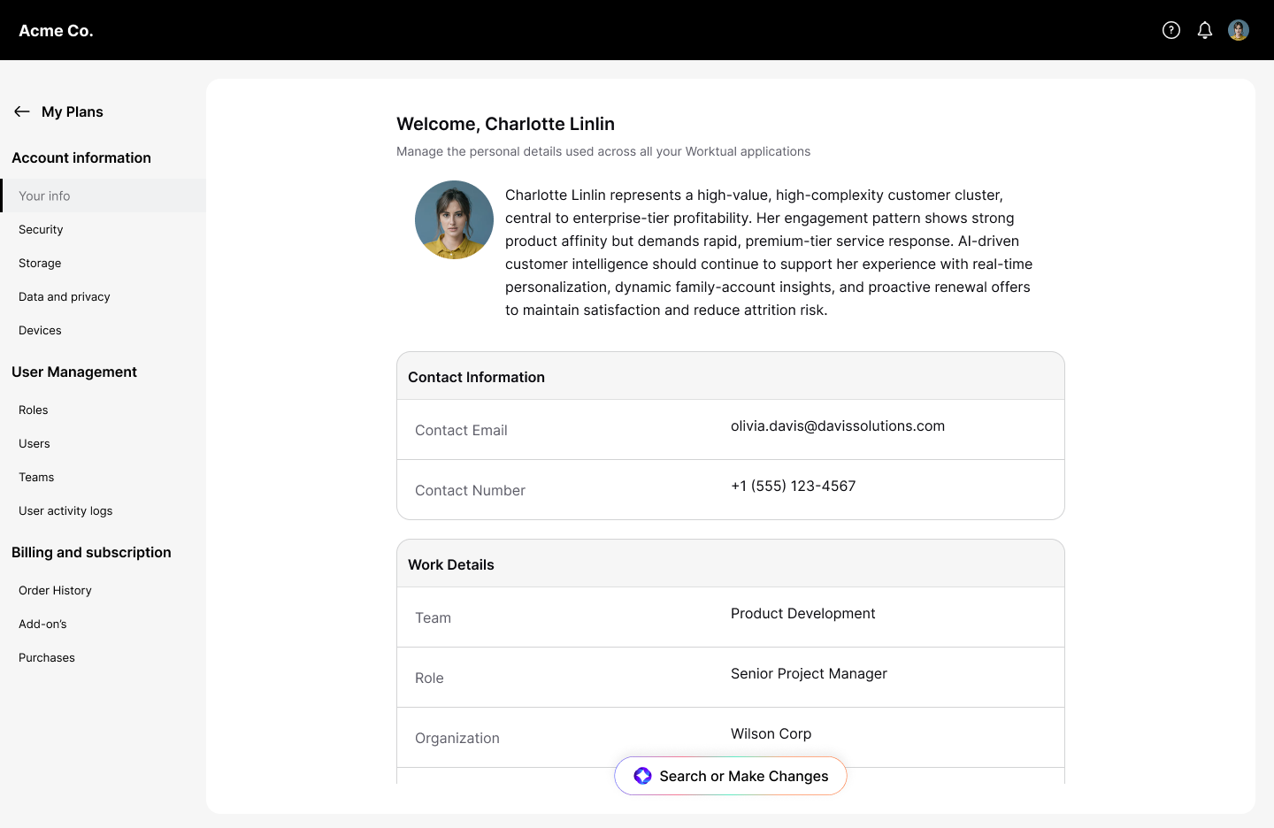
MyPlans brings everything an administrator needs — account, users, billing, and AI-assisted actions — into one consistent workspace, shared across every product in the company's lineup.
Profile information, security settings, storage, connected devices, and privacy controls — previously scattered across disconnected pages — now live in a single, centralized section modeled on the account experiences admins already know from modern consumer products.
This was where complexity grew fastest as organizations scaled — the more users, teams, and roles, the more screens an admin had to move through just to configure access correctly. I connected user creation, custom role definitions, team organization, product access assignment, and activity monitoring into a single workflow, so admins can manage who has access to what without piecing it together across disconnected screens.
Subscription details, invoices, usage limits, and add-ons were typically spread across separate sections, making it hard to see where an organization actually stood. I brought all of it into one billing workspace — subscription details, invoices, usage tracking, add-ons, and billing history, viewable together.
The most significant shift was layering conversational AI on top of all of it — not as a bolt-on feature, but as the primary way admins complete common actions: creating users, assigning roles, managing teams, updating permissions, purchasing add-ons, managing subscriptions. An admin describes what they need done, and the system carries out the action directly, cutting out the repetitive screen-by-screen navigation that defined every competitor product I researched.
MyPlans replaced a fragmented, tab-heavy admin experience with one unified workspace — consolidating account, user, and billing management, with conversational AI handling the most repetitive actions directly instead of routing admins through multi-step forms.
Real usage numbers (time-to-complete a task, support ticket volume, or percentage of actions completed via AI) go here once tracked post-launch — that's the detail that makes this section land with hiring managers, so it's worth adding as soon as it's available.
Owning MyPlans end-to-end, solo, was a different kind of challenge than working within a larger team. Every architectural decision — how account, users, billing, and AI actions related to one another — was mine to make and defend, which meant the research phase carried more weight than usual. Getting the information architecture right early mattered, since a wrong structural call would have been expensive to unwind later inside a one-month timeline.
The hardest decision was how far to push conversational AI as the primary interaction model rather than a secondary shortcut. It would have been safer to keep traditional forms as the main path and add AI on the side, the way most competitors do. Committing to AI-first for core admin actions meant designing fallback paths carefully, so admins who preferred traditional controls weren't penalized for it.
If I extended this further, I'd want to pressure-test the conversational flows against more ambiguous, real-world admin requests — not just clean, well-formed examples — to see where the natural language model needed more guardrails.
Concept, script, and storyboard for a 30-second promo video that had to make an abstract idea — churn risk detected before it happens — feel immediate and visual in under half a minute.
Write the concept, script, and storyboard for a 30-second product video introducing an AI-powered Customer Data Platform with Customer Value Management capabilities — aimed squarely at CMOs in retail and hospitality, an audience with very little patience for another generic "AI-powered" pitch.
The idea the video needed to land in twenty seconds: customer churn almost never happens all at once. It builds quietly, through signals that get missed — an unopened email, a skipped store visit, a complaint that never got resolved. By the time a business notices, the customer is already gone.
The product's answer is to unify those fragmented signals — email opens, store visits, complaint history — into a single connected customer profile, and use that profile to catch churn risk before it happens instead of explaining it after the fact. Once a customer is flagged as at-risk, the platform triggers a re-engagement offer automatically, turning a passive warning into a direct action.
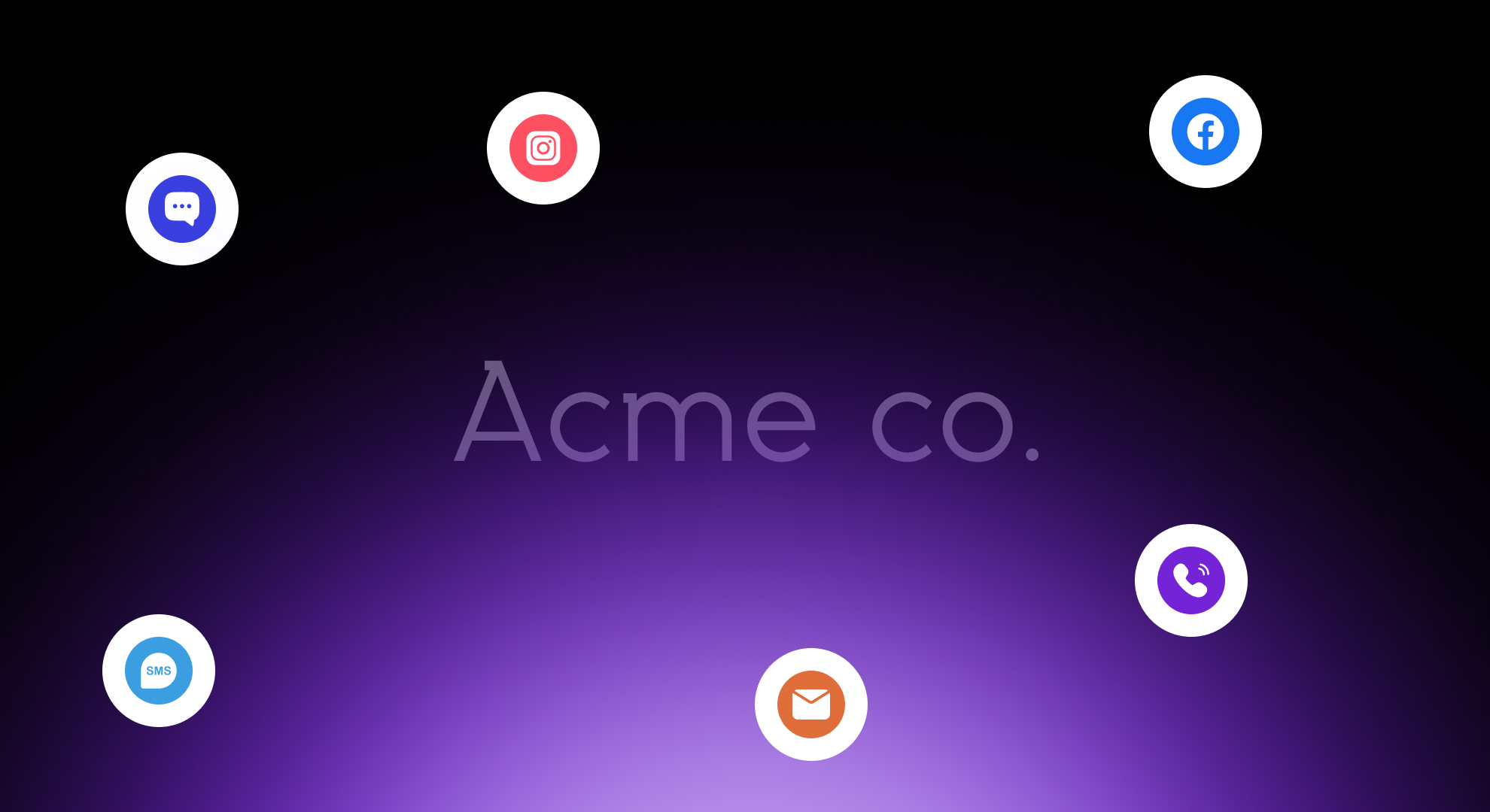
The video opens on a customer rendered as light and scattered data points — present, but not yet whole. No shape has formed. It's a quiet visual metaphor for a customer slipping away before anyone notices.
Beat 01 — signals with nowhere to land. The customer hasn't taken shape yet.
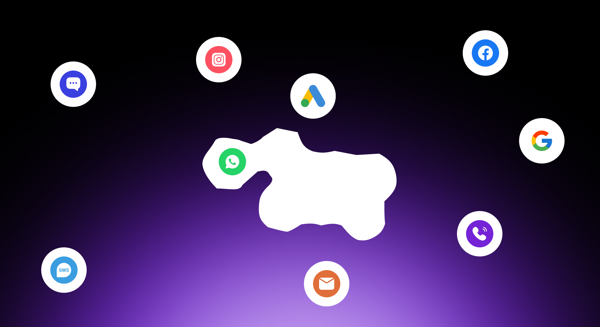
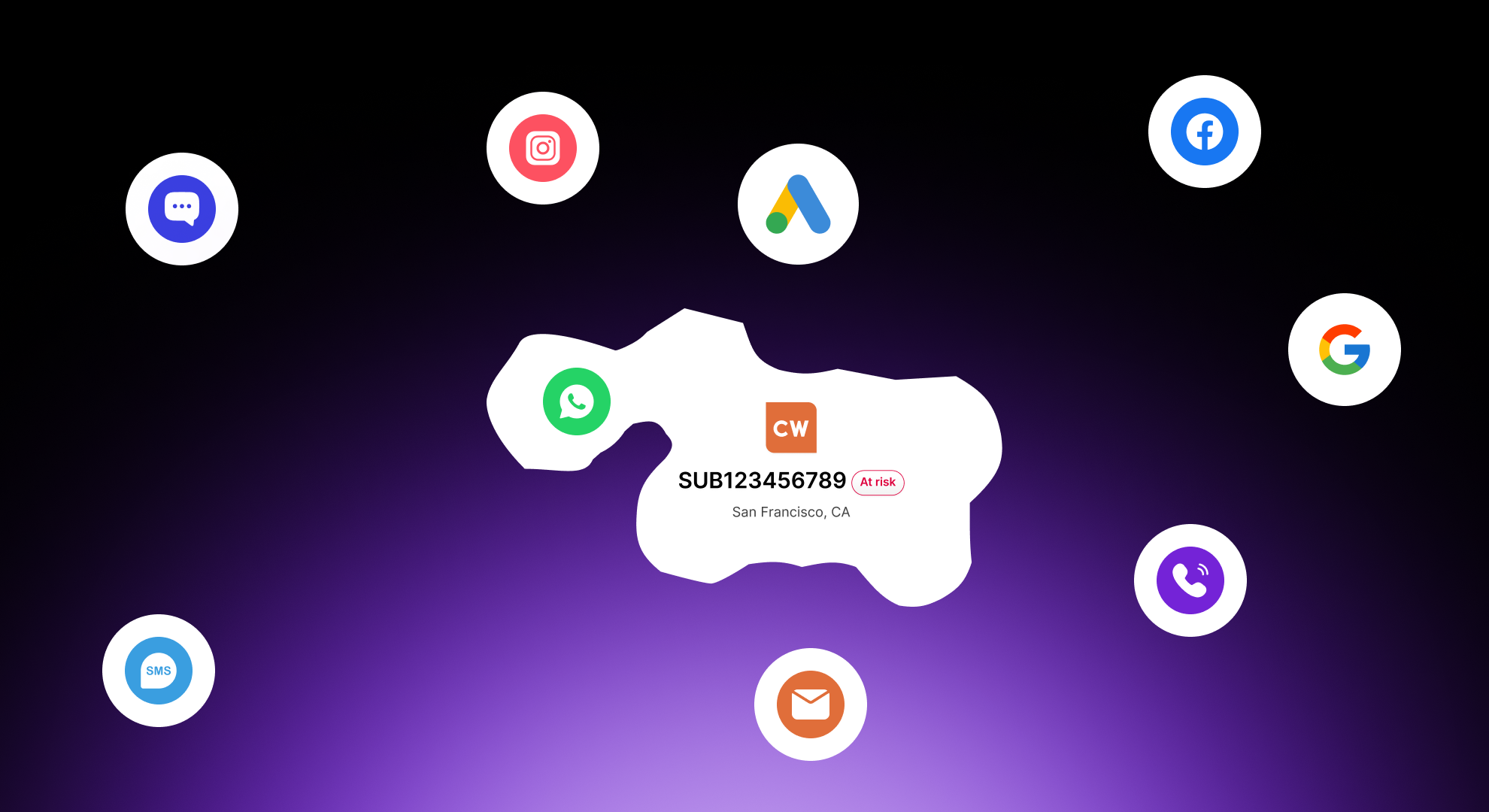
As the product enters the story, that absence starts to fill in. Scattered signals — chat, social, calls, email — pull together into a single connected shape, mirroring how the platform gathers fragmented touchpoints into one unified customer view.
Beat 02 — the same signals now converge into one unified customer profile.
Animation clip — signal-to-silhouette formation
When the re-engagement offer triggers, the silhouette resolves from a data-point outline into a labeled, at-risk customer record — the moment the platform turns detection into action.
Beat 03 — risk is identified and named, ready for a re-engagement offer to fire.
The video closes on a deliberately understated line, positioning the platform against generic "AI-powered" claims in the category before landing on its real promise: intelligence built specifically around the client's own data, not a generic model.
The result on screen ties the story directly to a number: a 20% reduction in churn, alongside a supporting 28% boost in reactivation reported by a past client — turning an abstract "AI catches churn early" pitch into something a CMO can act on.